One cooperative card game, eight complete visual identities. Everything below is drawn live from the same stylesheets the game runs on — pick a skin and the whole page becomes it.
00 · The mark
Logo
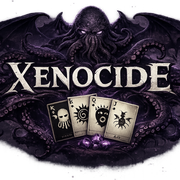
Two lockups. The emblem is primary — it carries its own dark field, so it holds on every skin including the light ones, and it's what the game leads with. The horizontal lockup is for wide, dark surfaces: a header, a social card, a title bar. Both are raster; the rest of this kit is vector or CSS.
Its letterforms are bone-coloured. The source had no alpha channel — a baked black rectangle — so it was keyed to transparency here, which stops it fencing itself in a box. It still can't go on a light field: the type simply disappears. On paper skins, use the emblem.
Keep clear space of at least the cap-height of the X on every side. Don't recolour, outline, rotate, or set either mark on a busy image. Minimum legible widths: emblem 140px, lockup 220px — below that the card art in the mark turns to mush.
01 · The skins
Eight identities, one contract
A skin is a single [data-theme] block filling 65 tokens — no markup,
no assets, no exceptions. That's why the twelve illustrations below re-ink themselves
when you switch: they paint only in --art-ink and --card-bg.
Each button carries its own colours, so the row above is also the palette at a glance.
02 · Colour
Palette
Read live from the active skin. Tokens ending -rgb hold a bare
R G B triple because they get wrapped as rgb(var(--token) / .4);
everything else is a plain CSS value. Health and attack are semantic ramps — blue
through mauve for health, silver through charcoal for attack in the default skin — and
must never be confusable with the highlight.
03 · Type
Typography
Two faces per skin — --font-display for headings, card faces and numerals,
--font-ui for everything else — plus --root-size, which scales the
entire rem-based layout. Numerals are pinned to lining figures: most Garamond-family
faces default to oldstyle, which renders 13 as I 3.
04 · The deck
Cards
Three sizes off one stock. Suit is the load-bearing signal — four cards of the same
rank differ only by suit, and enemy immunity is per-suit, so a misread is a misplay.
Each skin carries that separation by lightness, by hue, or both, and must clear
4.5:1 against the stock plus ΔE 22 between the two groups.
05 · The twelve
Royals
Kings are the Outer Gods, Queens the courts, Jacks the servitor races. All original
artwork, all inline SVG — no image files anywhere in this project. Entities are
Lovecraft / Chambers / Clark Ashton Smith era and public domain.
Lit surfaces are always currentColor; voids are always
var(--card-bg) — invert that pairing and a skull becomes a black face
with glowing sockets the moment the stock changes.
06 · Components
The table
The gradient sits on the track at full width and the spent end is covered, so a colour always means the same absolute value — 12 health is the same hue on a Jack as on a King. The pale band is a pending play: it must read as provisional against the committed value beneath it.
07 · The rule
Contrast is functional
Not a style preference — a skin that misses these makes the game harder to play. Measured live against the active skin, WCAG relative luminance plus CIEDE2000 for the suit pair, because separation can be carried by hue as easily as by lightness and a luminance-only test wrongly fails a skin that splits blue from slate.
| Pair | Measured | Floor | What breaks |
|---|